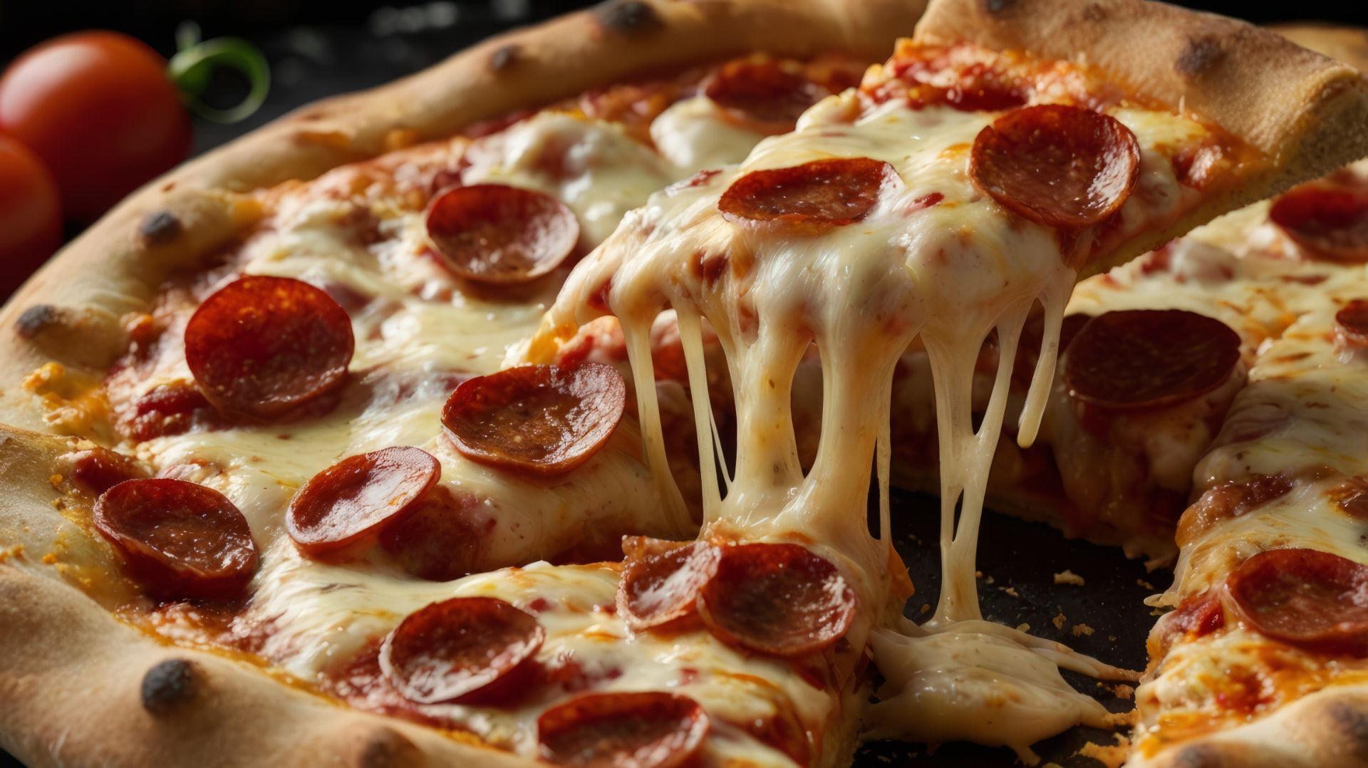
Recognisable identity
A familiar name and maple leaf customers already associate with the brand.

Refining a recognised brand into one connected identity, digital experience and personality.
A familiar name and maple leaf customers already associate with the brand.
A Toronto-to-Cyprus story competitors cannot replicate.
More than 50 years of recognition across generations of customers.
Strong existing assets ready to become one connected brand system.
The brand does not need replacing. It needs refining, connecting and activating.
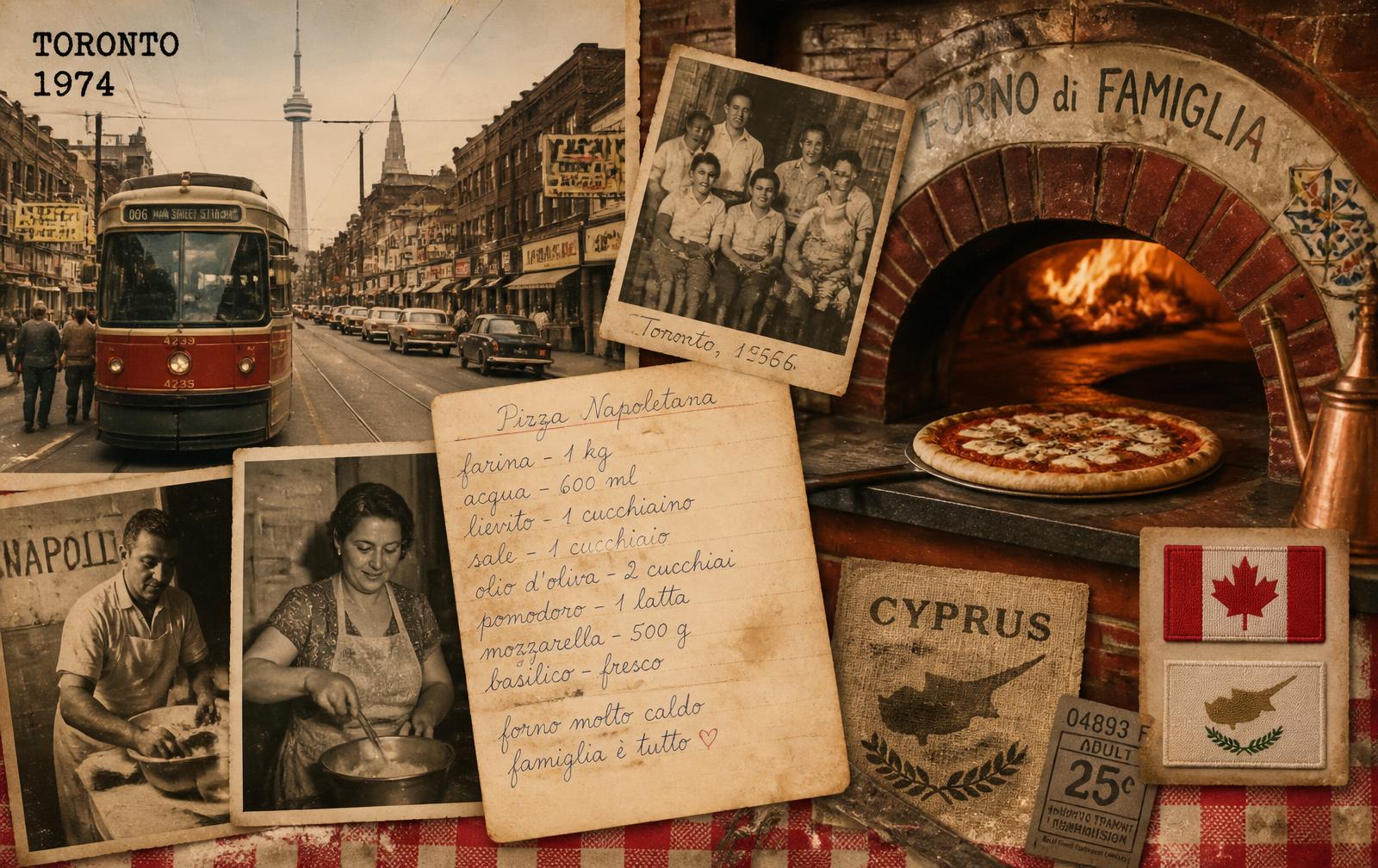
Toronto Pizza does not need to imitate a new artisan pizzeria or follow interchangeable food-brand trends. Its most ownable strategic advantage already exists inside its own history.
Canadian beginnings
The Toronto chapter that gave the brand its name and its symbol.
Italian knowledge
Pizza craft learned directly from Italian pizza maker Francesco Longo.
Cypriot legacy
Over 50 years of serving customers after bringing that knowledge home.
Heritage line
From Toronto to Cyprus since 1971.
"The Leaf Knows Pizza."
The brand already has recognition, history and visual familiarity, but these strengths are not yet working together as one complete experience.
The logo needs refinement
The maple leaf, typography, spacing and proportions can be redrawn with greater precision.
The identity lacks consistency
The website, packaging, promotions, stores and social content do not yet feel like one connected brand.
The digital experience feels functional
The website presents the menu but does not create enough appetite, emotion or guidance.
The ordering journey creates friction
Customers are asked to browse rather than being helped towards the right choice.
Toronto Pizza does not need an entirely new logo. It needs the existing logo to be professionally redrawn, preserving the identity people already recognise while correcting the inconsistencies that weaken its balance, clarity and overall finish.

Current logo · Construction issues
The maple leaf, red and green colour palette, Toronto wordmark, “pizza” descriptor and 1971 heritage should all remain central to the identity. The objective is refinement, not reinvention.
Maple leaf symmetry
Redraw the leaf so that its left and right sides feel balanced, intentional and properly constructed.
“1971” spacing and alignment
Correct the uneven spacing between the numbers and position the date more precisely beneath the leaf.
The shape of the R
Refine the construction of the R, including its curved form, leg and extended tail, so it connects naturally with the rest of the wordmark.
The shape of the N
Correct the structure and finishing tail of the N to improve its readability and relationship with the surrounding letters.
Letter spacing throughout “Toronto”
Rebalance the spaces between every letter so the wordmark reads as one cohesive, professionally drawn form.
Spacing within “pizza”
Improve the spacing and alignment of the lowercase letters so that “pizza” feels balanced beneath the main wordmark.
The result
A cleaner, more balanced and technically correct logo that retains Toronto Pizza’s existing recognition while creating a stronger foundation for packaging, stores, digital platforms, advertising and future brand communication.
Not a new logo. A better-drawn version of the logo people already know.
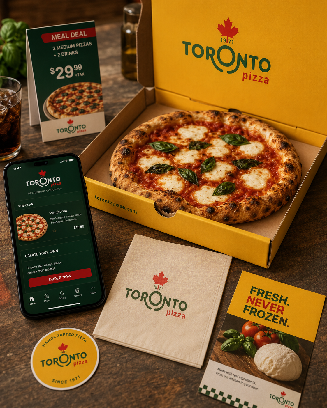
The logo becomes the foundation for a clearer and more consistent visual identity across every customer touchpoint.
Colour system
A controlled palette built around Toronto Pizza red, green and signature yellow, supported by complementary neutral tones.
Typography
A clear type hierarchy for menus, digital experiences, promotions and brand communication.
Food photography
Appetising, natural photography that makes the product the hero.
Graphic language
Shapes, patterns and visual elements inspired by the maple leaf and Toronto Pizza heritage.
Packaging
A recognisable system across pizza boxes, bags, cups, napkins and delivery materials.
Campaigns and social
A consistent visual approach for offers, launches, seasonal promotions and everyday content.
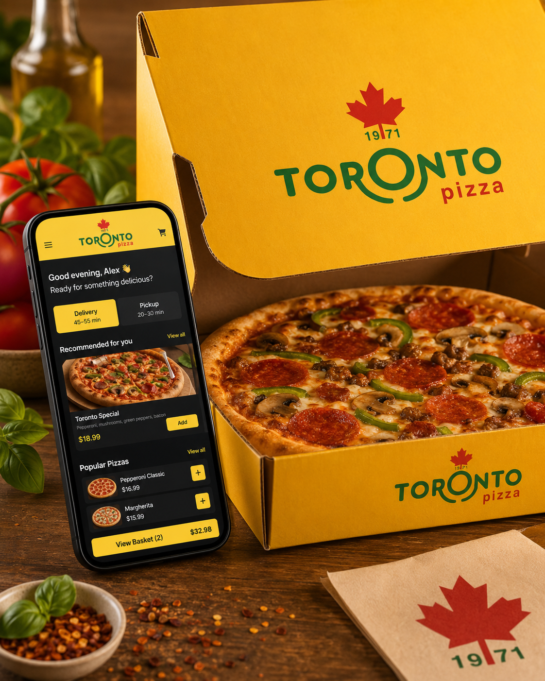
The new website should not simply display products. It should create appetite, communicate the Toronto Pizza story and guide customers quickly towards ordering.
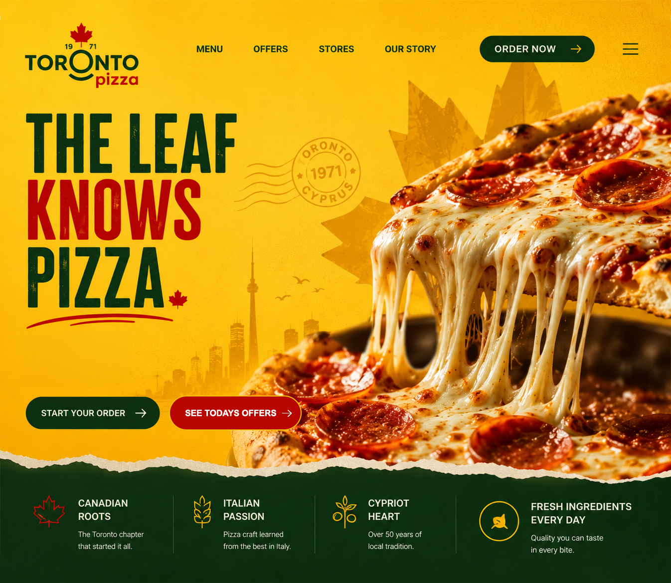
Food-first opening
Strong photography creates immediate appetite.
Clear ordering action
Ordering and offers remain visible throughout the journey.
Brand story
Toronto-to-Cyprus heritage is integrated without slowing the experience.
Mobile-first experience
Every step is designed for speed, clarity and ease of use.
Alongside the full menu, Toronto Pizza can offer a guided ordering route that recommends pizzas, sides and bundles based on how many people are being fed.
01 · Just me
Quick recommendations and individual meal options for one person.
02 · Two of us
Pizzas, sides and combinations designed for sharing.
03 · The family
Family-sized combinations, popular favourites and value-led offers.
04 · A group or office
Larger orders, bundles and practical options for groups, meetings and workplaces.
"Tell me who we’re feeding. I’ll narrow it down."
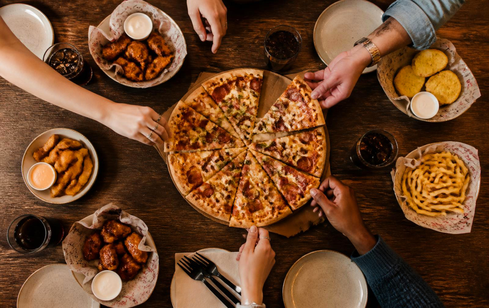
A clearer menu, fewer steps and offers designed to convert.
Photography-led menu
Appetising images guide customers to the right choice.
Popular choices first
Bestsellers and recommendations surfaced immediately.
Simpler ordering
Sizes, crusts, toppings, sides and drinks added in fewer steps.
Branded offers
Memorable bundles built around real occasions, from The Family Fix to Feed the Team.
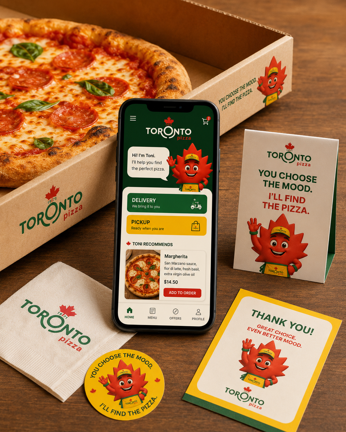
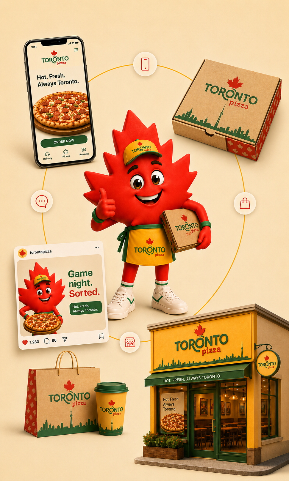
With the identity refined and the digital experience rebuilt, Toni turns the maple leaf into a recognisable brand personality. He guides customers, introduces offers and gives Toronto Pizza a character no competitor can copy. He is not just a mascot, but the face of the brand experience.
A recognisable personality
Confident, quick and slightly cheeky, Toni gives Toronto Pizza a consistent voice customers can recognise and remember.
A helpful digital host
Toni guides customers through the menu, recommends pizzas and makes ordering simpler and more personal.
Built for every touchpoint
From the website and social media to packaging, stores and promotions, Toni connects the complete experience.
A platform for campaigns
Toni can lead seasonal promotions, introduce products and create recurring content that keeps Toronto Pizza visible and relevant.
"Tell me who we're feeding. I'll find the pizza."
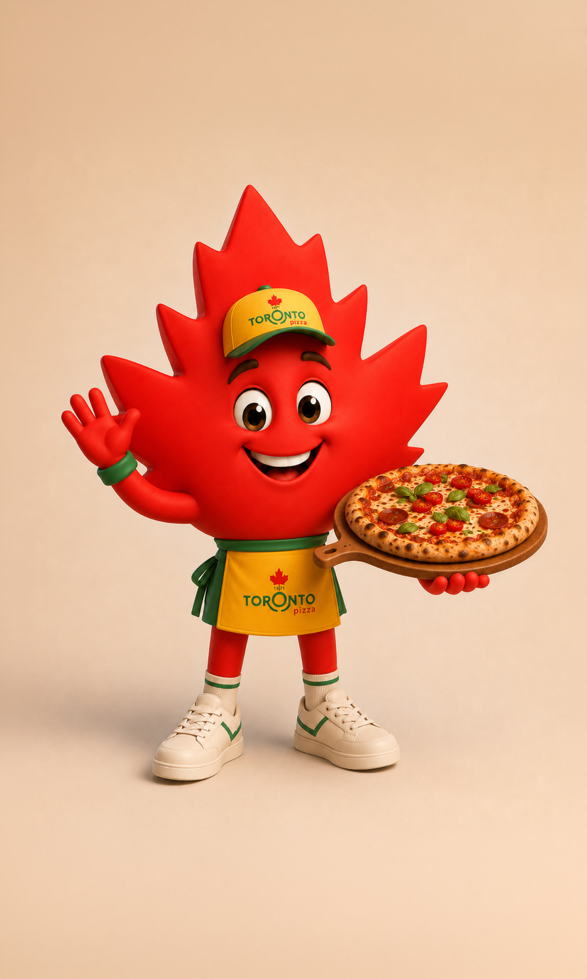
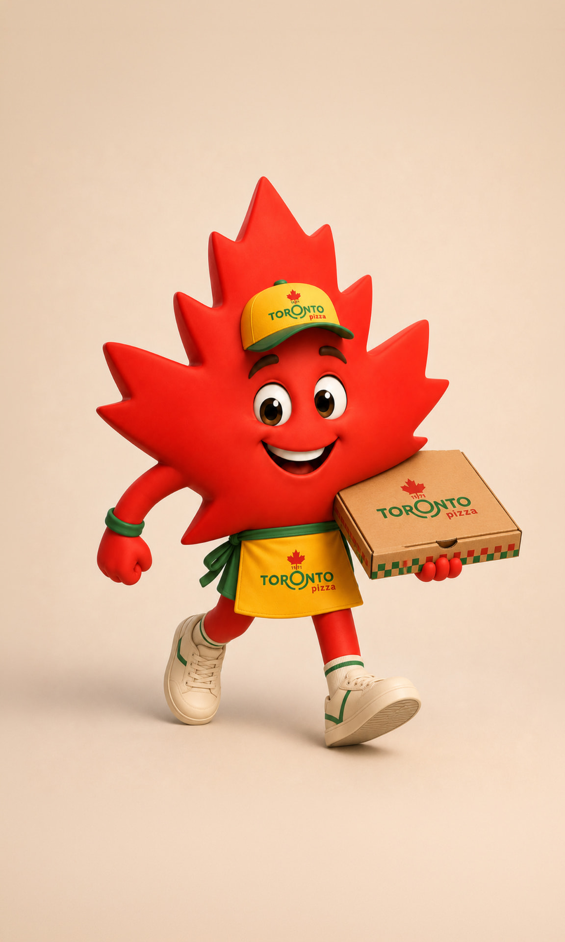
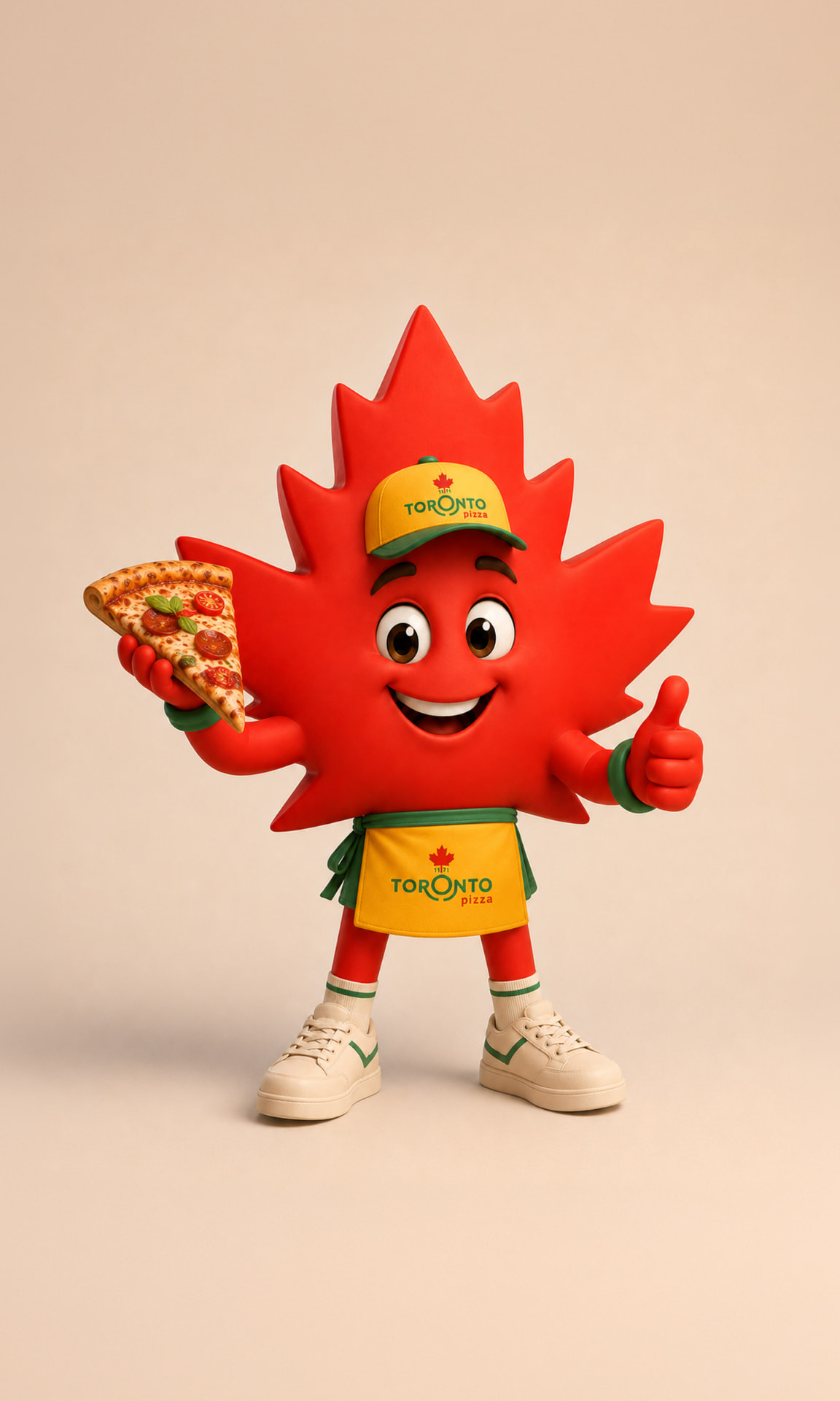

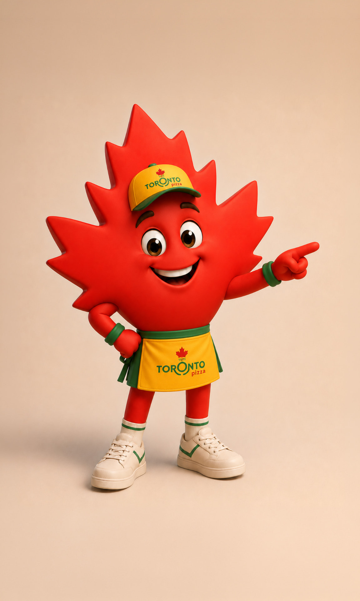
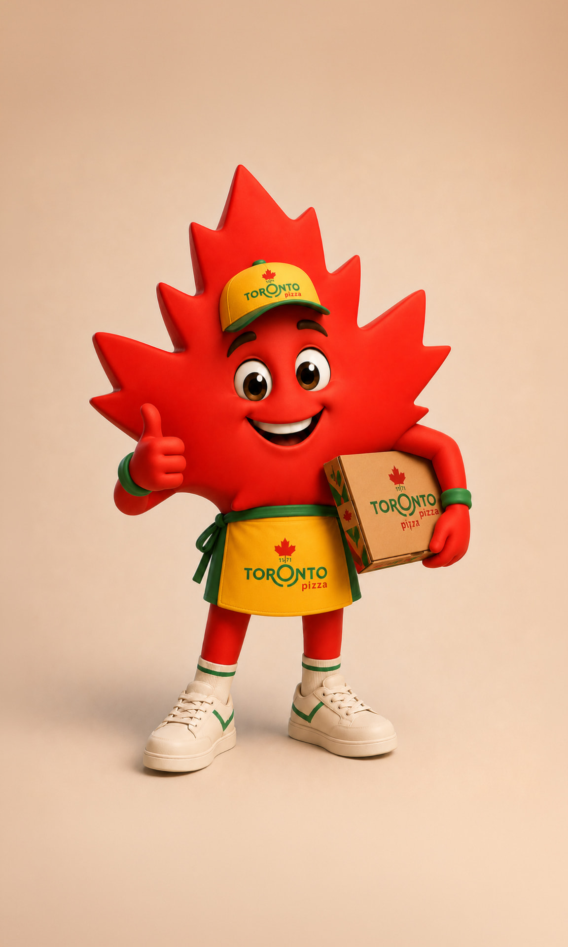
The logo, website and Maple leaf are not separate ideas. Together, they create one connected system designed to strengthen recognition, improve the customer experience, build distinction and support long-term growth.
Phase 1 · Strengthen recognition
Refine the logo and establish a consistent visual identity. Outcome: a clearer and more professional brand foundation.
Phase 2 · Improve the experience
Create a faster, more appetising website and ordering journey. Outcome: easier choices, stronger offers and more completed orders.
Phase 3 · Create distinction
Activate Toni across digital, packaging, stores, campaigns and social media. Outcome: a memorable personality competitors cannot copy.
Phase 4 · Drive growth
Use the complete brand system to support loyalty, promotions, campaigns and optimisation. Outcome: more engagement, repeat orders and long-term value.
"A stronger identity attracts attention. A better experience converts it. A distinctive personality keeps the brand remembered."
Thriving Venture combines brand thinking, digital development, AI technology and content production within one team. This allows us to create a clear direction for Toronto Pizza and then implement it consistently across every customer touchpoint.
Bespoke, not off-the-shelf
Every solution is built around Toronto Pizza's brand, customers and commercial needs.
Strategy that gets executed
We can take the project from logo refinement and brand identity through to the website, ordering experience, content and campaigns.
Creative and technical capability
Design, development, AI and production are managed as one connected process rather than through multiple suppliers.
Local understanding, international standards
As a Cyprus-based team, we understand the market while creating work designed to compete at a much higher level.
"We have the capability to help Toronto Pizza protect what made it recognisable and build the brand into its full potential."
Projects showing how we build brand characters, digital ambassadors and food-led campaign content, from creation through to full execution.
An established mascot turned into an active digital spokesperson across television and social media.
Thriving Venture
AI-native technology and content